
|
    Professional Email Marketing Solutions |
15 Steps to the Ultimate Lead Generation Landing Page
Author: raintoday
If you’re looking to build a lead capture landing page, it’s not just a matter of slapping a form on a page and driving traffic to it. Well, you could do that, but it wouldn’t perform well.
Instead, follow these 15 steps and create a high-performance landing page designed specifically for gathering leads..gif)
Step 1. Define Your Target Market and Campaign Goal
Before you start building anything, you need to know whom you are marketing to. Chances are you’re creating a campaign for one of the following targets:
- Existing customers: You might think having customers means you don’t need to continue marketing to them. Sometimes a customer is inactive, so your goal is reengagement through exposure to new content that may turn them from a fence-sitter back into a real customer.
- Leads in your email or CRM lists: Once you’ve established a list of leads, your goal should be to nurture them with more content and events to turn them into customers. Perhaps you get them to register for an ecourse, using autoresponders to drip content into their inboxes, slowly building a rapport that eventually moves from a soft sell content marketing strategy to a request to sign up (potentially with a special offer).
- Prospects: This is the purest form of lead capture, where you are chasing entirely new prospects through the use of content marketing.
Lead form tip: If you are marketing to customers or leads, pre-populate as many of your lead capture landing page form fields as you can to reduce the friction involved in filling out the form and to create a sense of personalization.
Step 2. Define and Create a Relevant Reward
Having established your target audience, you need to figure out what to offer them in order to get their important personal or business data.
Everyone likes to be rewarded, getting free stuff is awesome. But with lead generation, there’s a little work to do first, and it gets pretty personal. Typically the very minimum a prospect, lead, or customer will have to part with is an email address (covered in step 3).
Before thinking about what you want in exchange for your content, you need to define the content and make it relevant to your target’s needs. Below are some of the things you can create. First I’ll list them, then I’ll explain how they should be used differently for prospects, leads, and customers.
- An ecourse delivered over a period of time
- Report/white paper with important industry stats
- Ebooks: comprehensive guides to different aspects of your business
- A newsletter with tips related to your area of expertise
- A podcast: useful for people who like to listen during a commute or workout
- Checklists/scorecards: good for people who need to see how well they are doing and produce a to-do list of things to improve
- Webinars: live sessions, often Q&A with experts and special guest presenters
- Presentations: slides you can incorporate into your presentations
- Consultation: when someone requests your time to explore if they want to use your product or service
Prospects: Prospects are people you haven’t come into contact with yet, so they need extra reasons to believe in what you’re giving away. They need a softer sell, usually educational material that doesn’t push your product, such as an ebook.
Leads: Leads are prospects who have converted by already consuming some of your content. These are the people you really want to convert into customers. They should receive content that has signup calls to action (CTAs).
Customers: Customers come in two forms: active and inactive. Your goals here are to keep active customers happy with instructional material that makes their life easier and to re-engage your inactive customers with special offers and updates on new features that could reactivate them. Customers are prime candidates for newsletters and ecourses.
Crucial to your success with lead gen is to balance the reward (the size of the prize) with the friction involved in getting it. This is where your choice of form fields comes into play.
Step 3. Define the Required Form Fields
What’s an appropriate number of form fields to complete in exchange for your content? Ideally, you would test this to find out what number of fields converts the best, while still getting the data you need to successfully segment and remarket to them in the future.
Here’s a breakdown of the content listed in the last section with an appropriate level of information you should ask for. (Note these are simple guidelines. Every situation will be slightly different.)
Email address only
- Presentation slides
- Checklist/scorecard
- Podcast
Name and email address
You want their name so you can provide a more personalized experience over a period of time.
- Ebook
- Newsletter
- Ecourse
- Report/white paper
Name, email address, and company information
Company information might include size of company and phone number. This information is often used for longer sales cycle items.
- Webinar
- Consultation
- Product demo
Note: you could ask for a lot more, but realistically an email address is all you really need for most things.
Step 4. Craft a Headline to Match Your Promotional Ad Source
Message match is the term used to describe the connection between the CTA of an advertisement and the headline of the destination page.
There are two reasons why this is important:
- The human factor: When someone clicks a CTA they have a level of intent that must be matched when they arrive at their destination. Example: they clicked on an ad for used pickup trucks, and they arrived at the homepage of a used car business where there was no direct mention of pickup trucks. Immediately the message match has been broken, and they feel like they have made a bad click. The end result of this is that they either get lost trying to find what they came for, or more likely they just hit the back button and leave.
- The machine factor: People aren’t the only ones affected by poor message match. If you are doing paid advertising such as Google AdWords, a bot reads your target page to see if there is a connection to the keywords in the ad. In the previous example, you’d get a lower Google Quality Score for your ad and consequently a higher price for your ad.
Here’s an example from an Unbounce banner CTA that sits at the end of our blog posts. Read the text on the button, as this will be the last thing in the mind of a visitor when they click it.

Now consider the headline in the destination landing page and how closely it matches that of the CTA:
Always pay close attention to your message, and you’ll increase your conversion rates by virtue of more people staying on a page they asked to visit.
Step 5. Establish Relevant Trust Elements
Trust is key to making people believe you won’t spam them after they give you their email address. Social proof is a key element here, as you’ll see in the list of trust elements you can include on your page:
- Registrant count: If you are running a webinar, list the number of registrants to encourage a herd mentality (if that many people are going, it must be good). Note: only start listing the number when it gets to an impressive count.
- Download count: Similarly, show how many people have downloaded your ebook.
- Share count: Displaying the social share numbers shows how many people find your content valuable enough to tell others about it. The best place to put this is on your confirmation page when they’ve already expressed interest.
- Anti-spam statement: Put a simple statement next to the email form field that says you won’t spam them ever.
- Testimonials: Customer testimonials show that others have made the effort to report back on the quality of your content. The best testimonials are video testimonials, followed by written ones with a photo and official title. Never use a fake testimonial; they’re usually easier to spot than a wig.
- Customer logos: If you have an impressive client list, take advantage of this by prominently showing them on your page.
- Media mentions: You’ve seen these before. It’s the list of logos from CNN, NBC, FOX News, TechCrunch, etc. If you’ve been lucky enough to have been mentioned in big publications or on TV, show off.
- Security badges: If you ask for sensitive data, include security badges to show you use security best practices, such as a secure server. Examples would be McAfee or Symantec.
- Content previews: Leverage people’s desire for “Try before you buy” by including a preview of your content, such as a chapter of your ebook. Amazon has perfected this with their “Look Inside” concept.
- Past content examples: If you are asking someone to sign up for a newsletter, show them an archived example so they know what they are signing up for.
Step 6. Write a Short Persuasive and Descriptive Introduction
Your opening paragraph should be a short and succinct extension of your headline, which serves as an introduction to some bullet points (coming up next) describing the service you’re promoting.
Let’s look at an example from a webinar registration:
Join us at 2 p.m. EST for a special webinar about lead gen landing pages, featuring [insert star name], hosted by [insert another star name]. We’ll be talking about best practices for generating leads using webinars (how meta), and we’ll be covering the following:
[Insert bullet points]
- Point 1
- Point 2
- Point 3
The star power and time limited component give it a persuasive edge, while the details and bullet points give it the descriptive clarity it needs to answer questions and convince visitors of the benefits of attending.
Step 7. Bullet Point the Key Benefits of Your Solution
Considering how little time most people spend on pages, you have maybe five seconds to capture their interest. Most of this is done via your headline. Assuming that has already happened, you need to dig into some simple benefit statements rather than rambling on in a long paragraph like this one.
If you can turn your text into three to five bullet points, each explaining why they should fill in your form, then your lead gen page will be more effective. As an exercise, let’s break down what I just said into bullets:
- You have 5 seconds to convince someone to stay
- Don’t use a rambling paragraph
- Use 3-5 bullets points
- Focus on the benefits
- Explain why someone should complete your lead gen form
See how much easier that was to read?
Point made.
Step 8. Decide on Image/Video Requirements
This is a classic A/B test: whether to use images or video on your page or none at all. The decision often comes down to the purpose of the page. Let’s run through some of the rewards you are giving away (from step 2) and see what would be most appropriate:
- Ebook: An image showing the cover and the authors is the most appropriate choice here.
- Ecourse: A personal video describing what the course is about is typical and is probably the most persuasive method.
- Webinar: Photos of the participants are the most powerful choice here.
- Podcast: Here you’d want a short audio clip.
- Slide presentation: An embedded SlideShare or Lightbox gallery presentation with a sample of the full version is a great idea here.
Let’s look at a couple of examples:
Ebook download
Webinar registration
Notice how each example uses only the required information in the form: a short introductory paragraph, bullet points, and relevant images.
Step 9. Write an Actionable CTA
This step is Conversion 101. Your CTA should describe exactly what will happen when you click on it. We just talked about message match, so you should understand the importance of a descriptive CTA.
To make it more actionable, use persuasive copy that has some urgency or benefit statements in it. Even simple words such as “Get,” “Try,” “Now,” or “Today” can work.
Here are examples of a good CTA and a bad CTA:
A good CTA: Look how clear the description on this button is. Both lines are very actionable and descriptive.
A bad CTA: The absolute worst thing you can ever write on your buttons is the dreaded “Submit” word, as it describes nothing about what’s going to happen when you click on it. If you’re using this on your buttons, go and change them right now!
Step 10. Create Urgency Factors
The key to creating a sense of urgency is to create the illusion of a pain point in the mind of the visitor to your page. To understand how this works, let’s first look at a couple of examples from the world of ecommerce.
Amazon delivery deadline: Amazon preys on the fear of not getting Christmas presents delivered on time. (Who wants crying kids on Christmas morning?) They do this by helpfully telling you the last day you should order to guarantee delivery by the date in question. They’ve taken this even further (as shown in the example below) where they apply urgency to any date—no doubt to capture last-minute present buying for birthdays, which can occur on any given date.
Expedia seats limitations: Expedia uses a live seat count for their flights to encourage immediate bookings. Looking at the best flight for your journey and seeing that there are only two seats left is a great way to add urgency to the booking process. Note that they do this only when there are a couple of seats left, not when there are 200 left.
I have no idea if there is actually one seat left or if this is just a ploy to encourage bookings. It works extremely well, though, from personal experience.
We can apply both principles to our lead gen pages as follows:
Ebook/report—free for a limited time: For an ebook download, you can say it’s free for a limited time only and after a certain date, it will cost $14.95, for example. This will increase the number of downloads before the date you choose, which of course can be continuously extended.
Webinar—limited seats: If you are running a webinar, you can increase both the urgency and exclusivity of the session by stating how many virtual seats are still available. Example: register now—only 20 of 100 spots left.
Essentially, anything you can do to create a scenario of urgency by utilizing a pain point will increase your lead gen form conversions.
Step 11. Apply the Principles of Conversion Centered Design (CCD)
CCD is a discipline targeted specifically at achieving the goals of a business from the standpoint that the primary purpose of any page is to guide the visitor toward one specific action. It’s an approach that uses persuasion and psychological devices to persuade a visitor to convert.
In the examples following, we take a basic lead capture landing page and transform it using three of the core principles of CCD: encapsulation, color contrast, and directional cues. The end result being a stronger lead gen form designed for conversion.
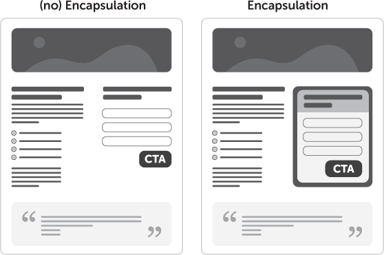
Encapsulation: Notice how the form stands out more in the version on the right thanks to an encapsulation container. This is most often done simply by placing the form in a containing box to provide a contrasting background.
Color & contrast: Now the form is really starting to pop. Notice how two primary areas of the form are brought forward by the use of color and contrast: the form header and the CTA. The reason for using the same contrasting color for both is to provide a sense of correlation. The header should contain pertinent information that describes what you are getting by submitting the form, as well as the benefit of doing so. Example: “Download our free ebook to master the art of conversion.”
Using the same color as the CTA will naturally allow your eye to follow the trail down to the CTA after reading the contents of the header.
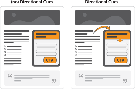
Directional cues: Notice the use of two arrows in the example on the right. By taking the previous version and adding some extra visual persuasion to the form, the first arrow brings your attention from the introductory copy to the form header (which as described above, should contain the description of the purpose of your form). And a second arrow takes you from the form header to the CTA.
Step 12. Architect for the Six-point Punch
The six-point punch is a concept based on the primary elements a successful lead gen page needs to be effective. Essentially, it acts like a checklist of the important elements already discussed—as a reminder that to be really conversion focused, you need to create a page that has all of these aspects working in concert together.
- Headline with strong message match: Here the ad that was clicked should be a very close match to the headline as discussed in step 5.
- Introduction with bullets: Remember to keep your intro short and simplified by using bullet points.
- An appropriate media choice: In the example below, an ebook image is shown.
- CCD-influenced lead gen form: The form area shows all of the CCD principles described in the last step.
- Urgency factors: Remember to add some kind of time, price, or space limited statement to your page.
- Trust factors: In the example below, testimonials are added to the bottom of the page. A good addition to this would be a preview of the ebook to let the visitor know what they are going to download.
Here’s a good example of an ebook download landing page with some of these principles in action. Later you’ll see how it could be improved via a collaborative A/B testing exercise.
Step 13. Decide What You Want to Do Post Conversion
Despite having a well-targeted and relevant reward on your page, you could be generating more paying customers from your prospects. I’m going to show you how.
It’s important to think about what will happen after you generate a new lead and what you want them to do now that you have their attention. You want to take advantage of that magic moment directly after the customer says, “Yes, I like you,” to keep them in your sphere of influence while they’re “in the mood.” You can do this by focusing their attention on the first thing they see after submitting your lead gen form—the confirmation page.
The lead generation confirmation page could be considered the digital equivalent of a supermarket candy shelf. Admit it, you’ve fallen victim to those shelves of sweet goodness stacked by the checkout as you wait in line, aimlessly throwing crap you don’t need into your basket.
What should you ask people to do on your confirmation page? Here are five quick tips you can implement now:
- Social: Ask them to follow you on a social media network or to share your page.
- Invite them to a webinar: Make sure the subject matter is closely related to the goals of the leads you’re capturing—and of the landing page they were just on.
- Give them a discount coupon (or code): If you give people a discount when they’re not asking for it and they don’t have to give you anything in return (after all, they just completed your lead gen form), they’ll get a great buzz from being treated so well.
- Send them to an important “What to Do Next” page: Many people enjoy a guided experience. Tell them what to do, and they’ll often do it. Use only a single link for this, and send them to a “Greatest Hits” or “Top 10” list page that shows off the very best content and information you have to offer.
- Ask them to subscribe to a newsletter: Newsletters (or a drip campaign if you want to push them through a progressive story arc) are a powerful permission marketing tool that keeps you in your leads stream of consciousness for an extended period of time. The confirmation page is a good time to ask if someone would like to participate if you can automatically transfer their details to the new newsletter email list without asking for more data.
Step 14. Create a Wireframe for Your Page
Before you start designing your page, grab a marker and use a whiteboard to lay out a wireframe for your page. There are a couple of reasons for this: it saves you design time by getting the layout right before you start building a page, and it allows you to run a few initial tests using your sketch.
Before you run the tests mentioned below, make sure your wireframe is quite detailed and includes some real copy and some CCD elements such as color and contrast.
The 5-second test
This is a fun one to do with a whiteboard, a piece of paper hanging on the wall if you decided to sketch it that way, or a printed out a page from a wire-framing tool such as Balsamiq.
Here’s how it works. Get a lineup of people who haven’t seen the page before, and one at a time, position them in front of the page with their eyes closed. Then ask them to open their eyes and look at the page. After five seconds, tell them to close their eyes and tell you what the page is about. If they can’t tell you after five seconds of exposure (the typical amount of time a visitor will stay if your page isn’t clear), then your core value proposition (headline) isn’t clear enough. If this happens repeatedly, rewrite and start again. Do this until you have a very clear page.
The 6-foot test
For this one, you need to stand six feet away from the sketch and see what the most dominant areas on the page are. If the CTA doesn’t stand out enough, you should consider adding more contrast, increasing the size, and adding some whitespace around it. Similarly, if the headline is buried, apply the same concepts to make it more easily readable.
Step 15. A/B Test Your Lead Capture Landing Page
Here’s where the real fun starts: running an A/B test on your page. But first you need to publish it and start driving traffic to it (from PPC, social, email, display, etc.).
When you start seeing conversion results from your landing page, you’ll undoubtedly come to the correct conclusion that it could be better—every page can be. This signals the time to run an A/B test. It’s also when the classic question of what to test comes up.
Before jumping into testing, you need to know a few of the fundamentals involved in the A/B testing process, as well as some techniques for figuring out what to test.
Gathering insight for a test
Before you know why you are going to run a test, you need to get some actionable insight into what could make your test effective. One of the best ways to do this is by using visitor feedback. This can be done in a number of ways:
- Use services like Qualaroo to add a survey to your pages to ask people questions about their experience.
- Use live chat on your pages so that you can talk to people at the point of conversion and figure out why they are sitting on the fence or what they need to become a converted customer. Unbounce recommends services such as Olark and ClickDesk.
- Send an email to your customers to find out what made them sign up.
- Use online usability tools such as usertesting or Loop11 to see where people drop off.
- Connect heat map software such as Crazy Egg to your page to see the most clicked and focused areas of the page.
- Brainstorm with people from different departments in your company.
Why are you testing?
A big mistake is trying to test something without a real purpose. This is where a test hypothesis comes in. This is a statement of what you are going to test and your theory behind why it will be a success. Example:
“The page does not have a clear call-to-action, and prospects spend too long trying to understand what to do next. Adding a large orange button right under the main benefits will help them identify the CTA and perform our desired action.”
Once you have a hypothesis, you’re in a better position to create a test page to compete against your original page.
How to test
Once you’re ready to run a test, you need to follow a few rules to ensure your experiment is clean:
- Each page in your test should receive at least 100 unique visitors.
- The test should last at least a week to account for different daily behaviors.
- The statistical significance of the experiment should be over 95% to remove the potential that your results are based on chance. This is a measure of confidence that your experiment is valid and can be ended, knowing that the results are trustworthy.
Brainstorming
Educated with how to gather feedback and run an effective test, we’re going to focus on one element of gathering insight—the group brainstorm.
A lot of feedback mechanisms are listed above, all of which are effective. Armed with the data from these techniques, you will be tempted to go it alone and try to figure out how to implement change. This will work most of the time, but having more than one opinion is a great way to establish new ideas and priorities.
Here’s a basic overview of the brainstorm process.
- Draw a giant version of your landing page on a whiteboard (or print it out as big as you can).
- Gather a representative from several departments/disciplines around the company (marketing, design, customer service, management, software development) as your brainstorm participants.
- Provide everyone with a block of stickies and a Sharpie pen.
- Write down a list of the primary page elements that could be tested to start the process.
- Ask everyone to come up with ideas to test as you walk through the list of elements. For each idea, they must write it down on a stickie and verbalize the idea as it’s passed to you (the facilitator) and stuck on the page in the relevant position.
- Open it up to big picture ideas with no restrictions.
- Once you have exhausted all of the ideas, have everyone come and vote (by checking a stickie) on their top three ideas.
- Create a prioritized list of ideas to test, ordered by the number of votes.
- Start testing
- A final point. Never stop testing. Test, rinse, and repeat. As I mentioned earlier, every page can be better.
As a result of a session like this, imagine our example from earlier, modified based on the principles we’ve learned along the way and the ideas gathered from a group brainstorm.
As you can see from this version, it now includes all of the elements of a great lead capture landing page:
- Reward: The ebook
- Appropriate form fields: Name and email address only, removing the unnecessary company and phone number
- A short introduction
- Three bullet points
- Relevant media choice: An image of the ebook, along with author photo and& bio below it
- Trust factors: A testimonial, ebook preview, and privacy policy
- Urgency: A time-limited free price offer
- CCD elements: Directional cues, encapsulation, and color contrast applied to the form area
- A descriptive CTA
So there we have it—15 actionable steps for creating the ultimate lead capture landing page. What do you think? Is there anything missing? Do you have another approach? I’ll see you in the comments, and don’t be shy.
Related Posts:

Leave a Reply

-HP, Information Industry Executive